
GermAttaxx
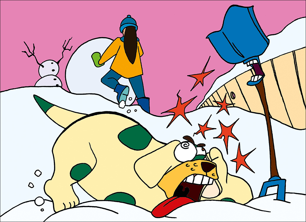
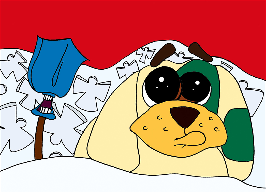
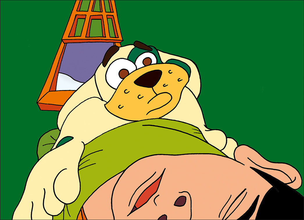
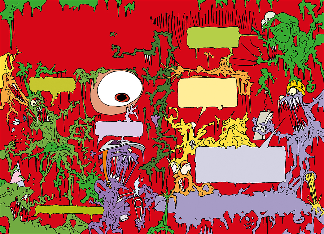
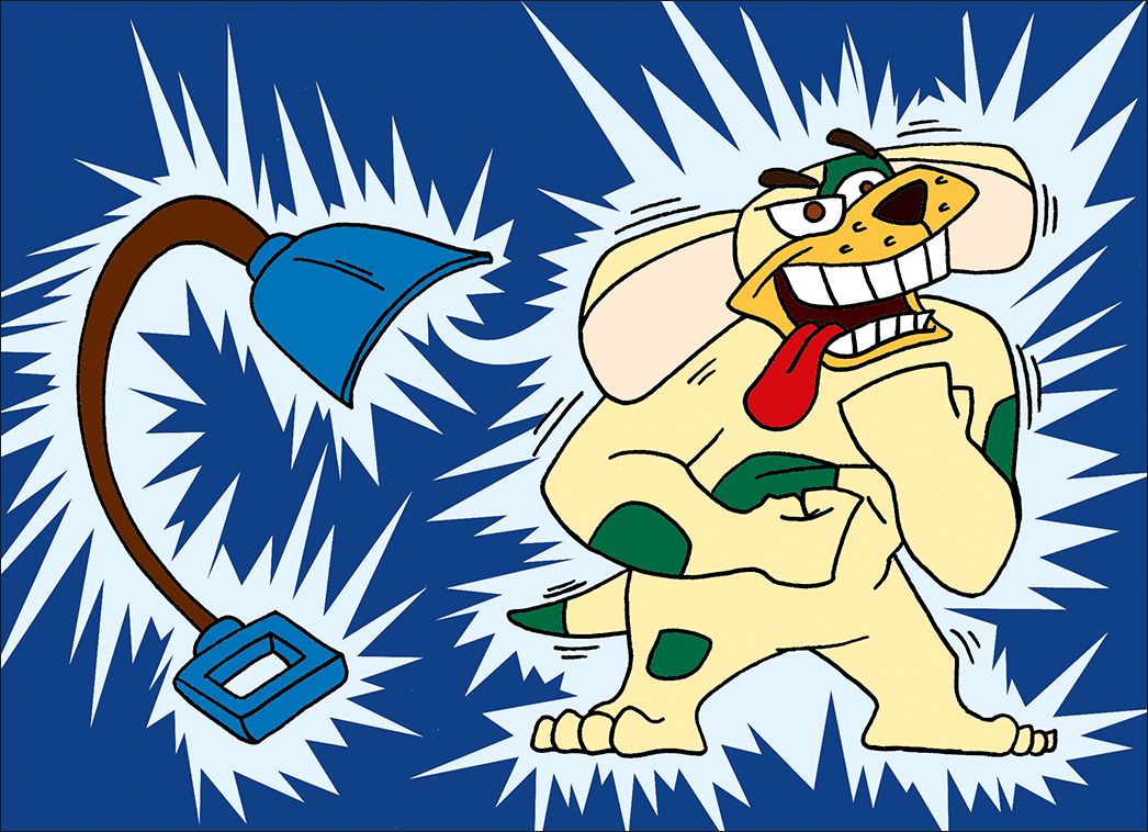
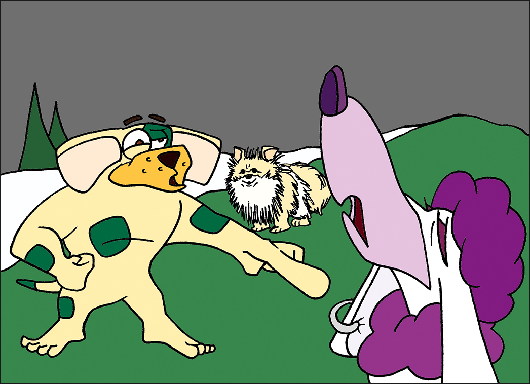
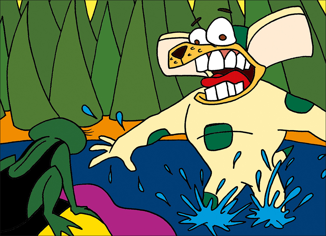
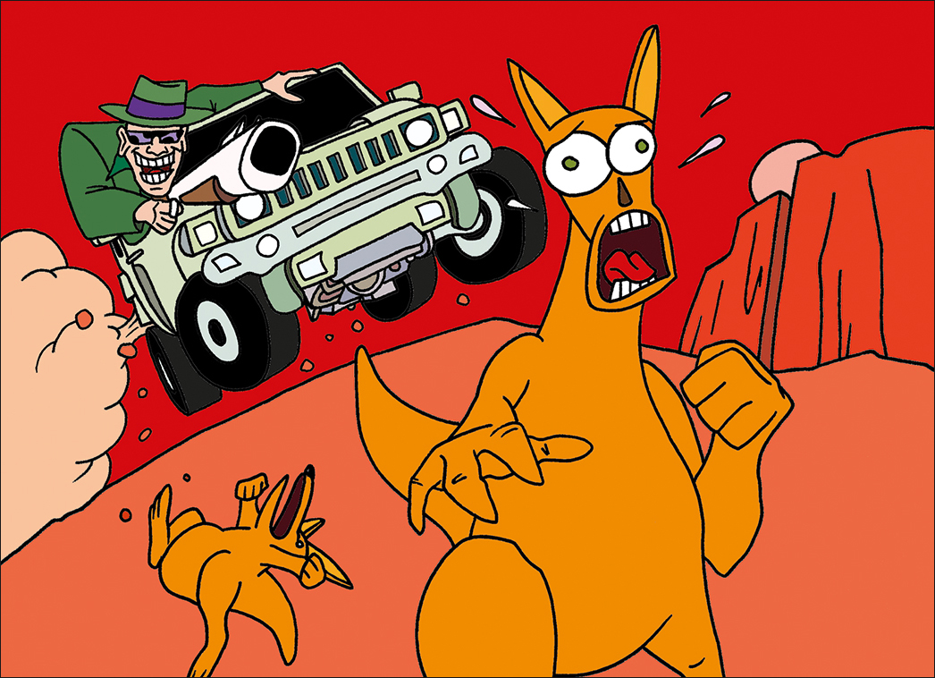
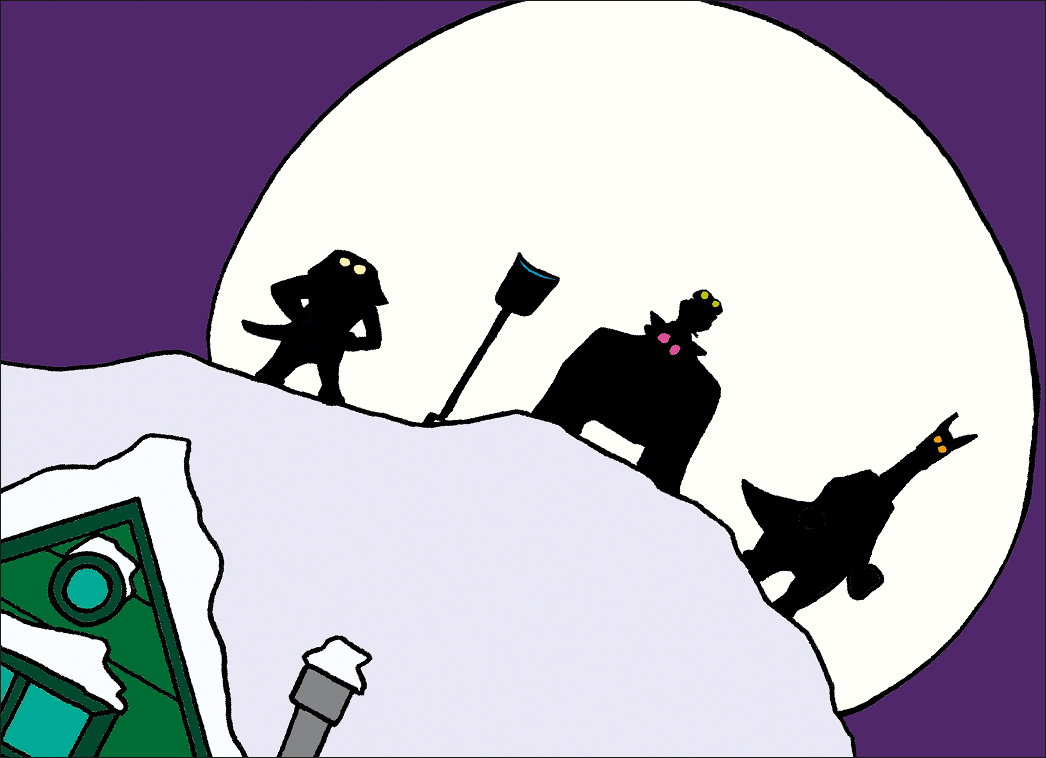
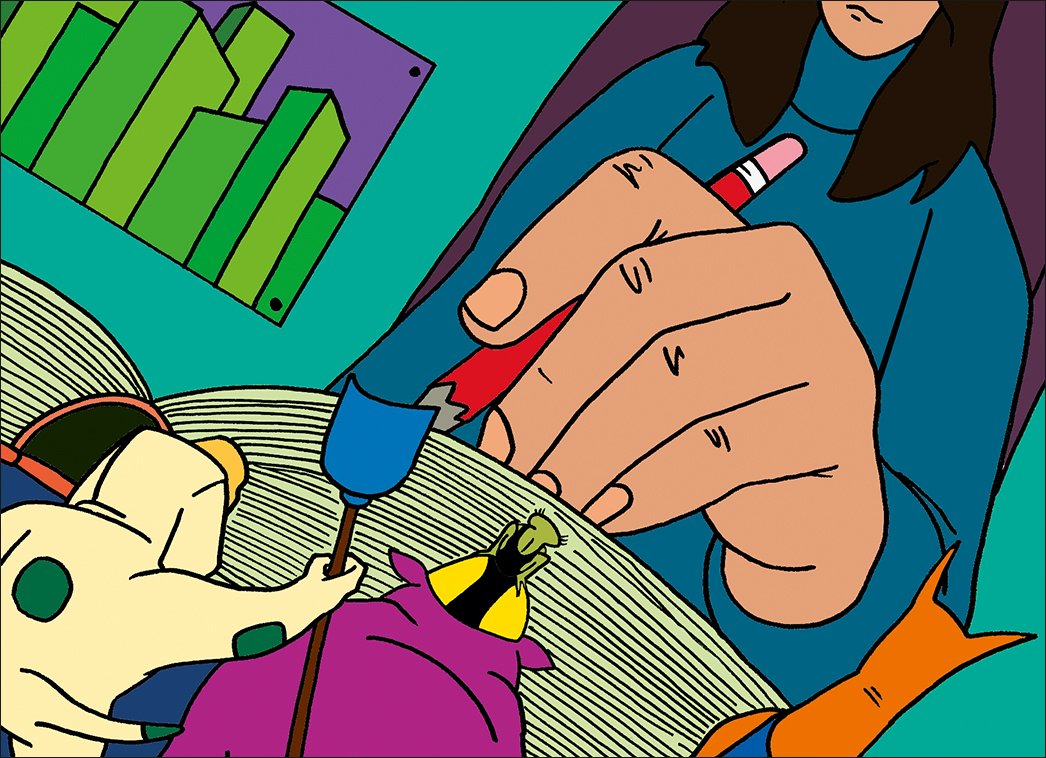
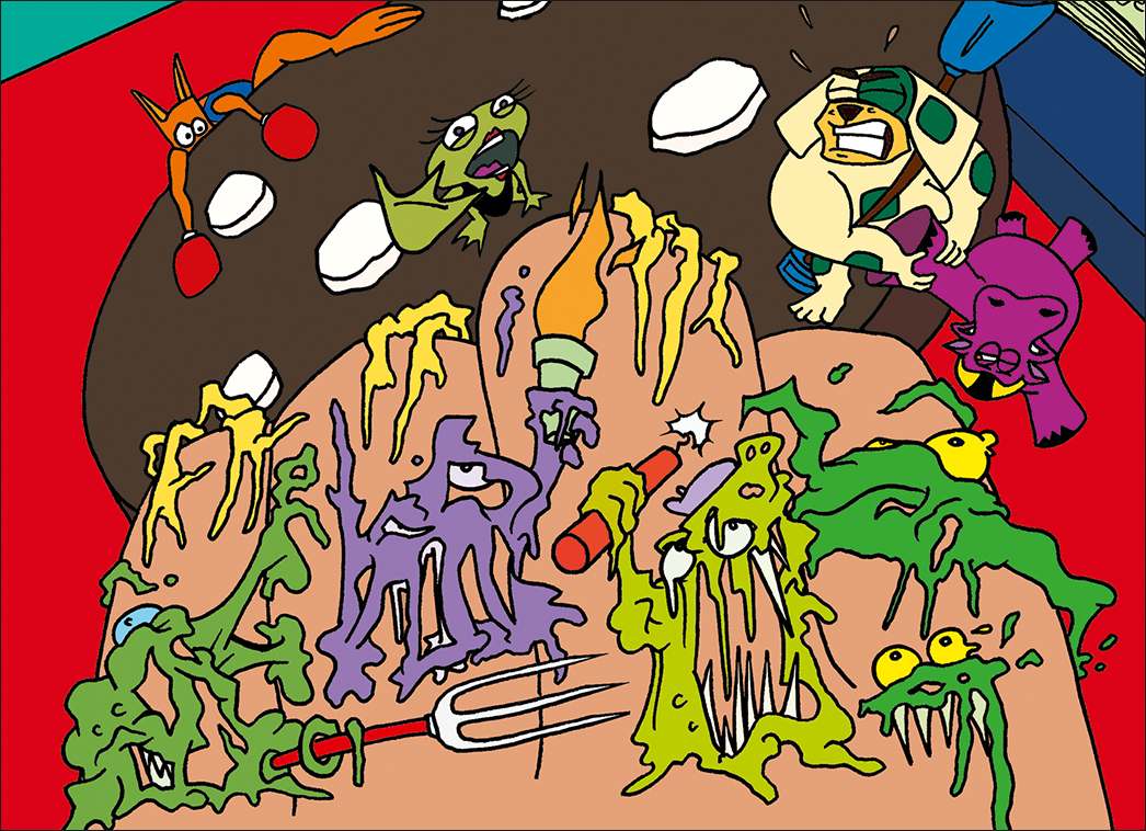
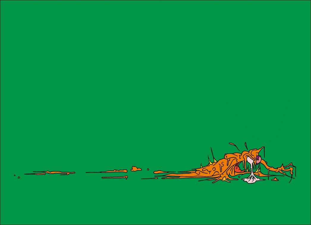
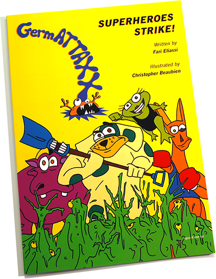

My first illustrated book was a marriage between monotonal type and energetic character design. The saturated colours and simple, streamlined style make a forceful impact.
For more information on the book, check out the GermAttaxx Website. It features a rapid animation sequence for the explosive introduction.
Along the lines of “RAID!” and “MR. YUK”, professionalism and playfulness is evident in the company logo. Its appeal to children comes across as colourful, yet conveys a serious message about personal hygiene. As a whole, the graphic element resembles a curving exclamation point.
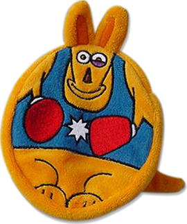
“GermATTAXX!” Travel Pack
Design Prototype: 3.5”’ x 4.75”
Based on Fari Eliassi′s concept, the tops of these small travel packs were accurately produced following my final packaging and character designs.
© 2015, Rainbeau Creative | Beaubien. All rights reserved.
Leave a Reply